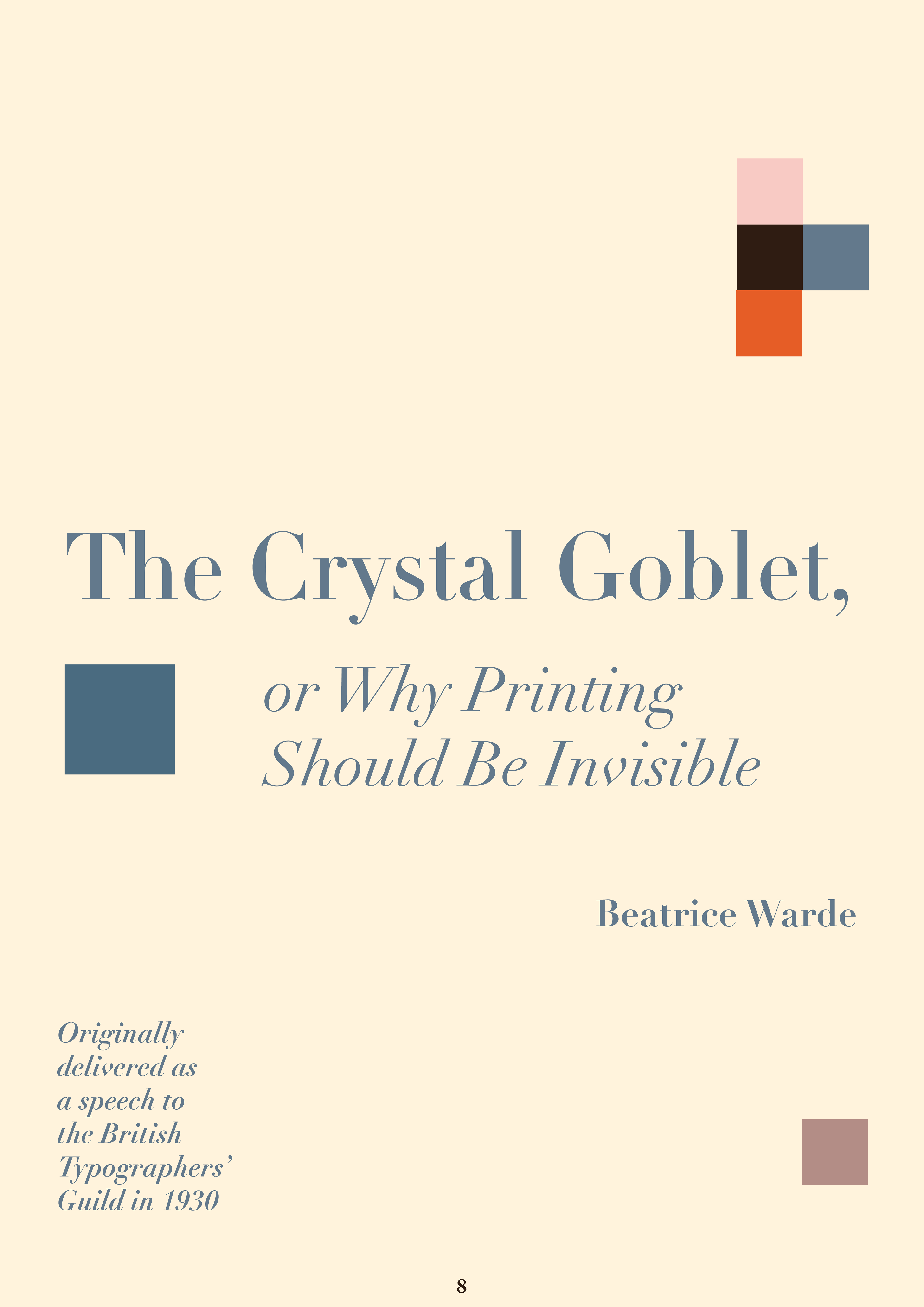
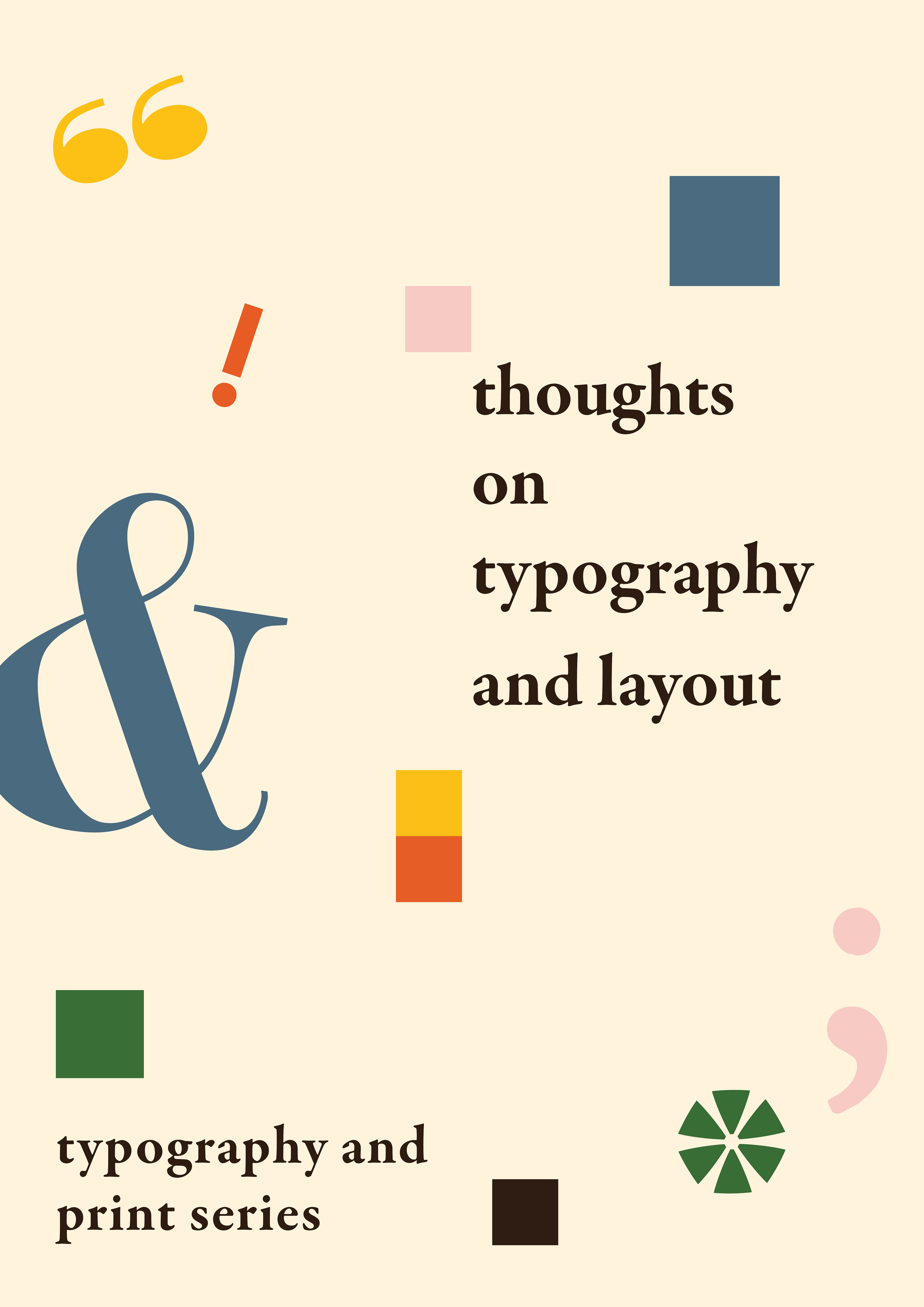
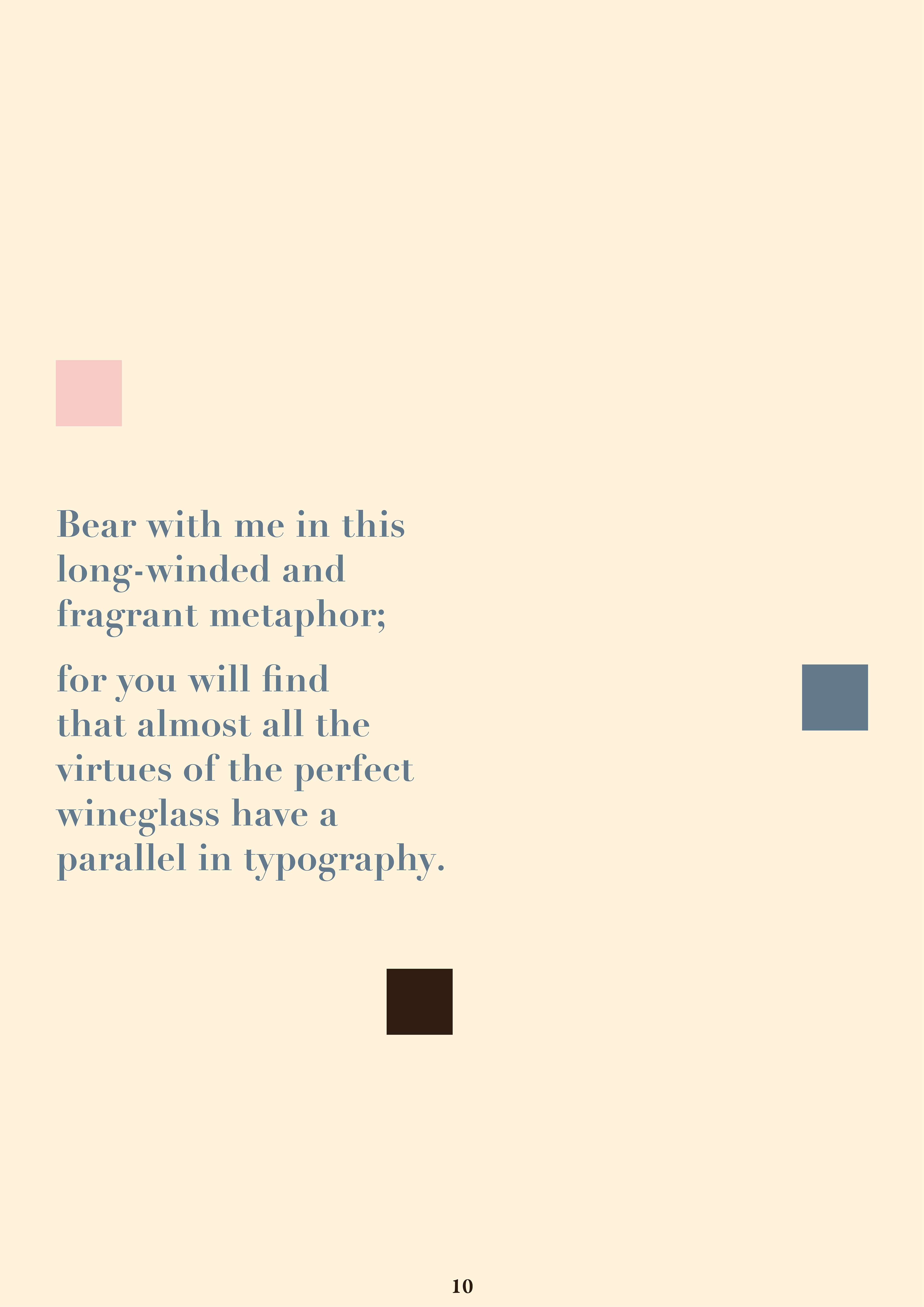
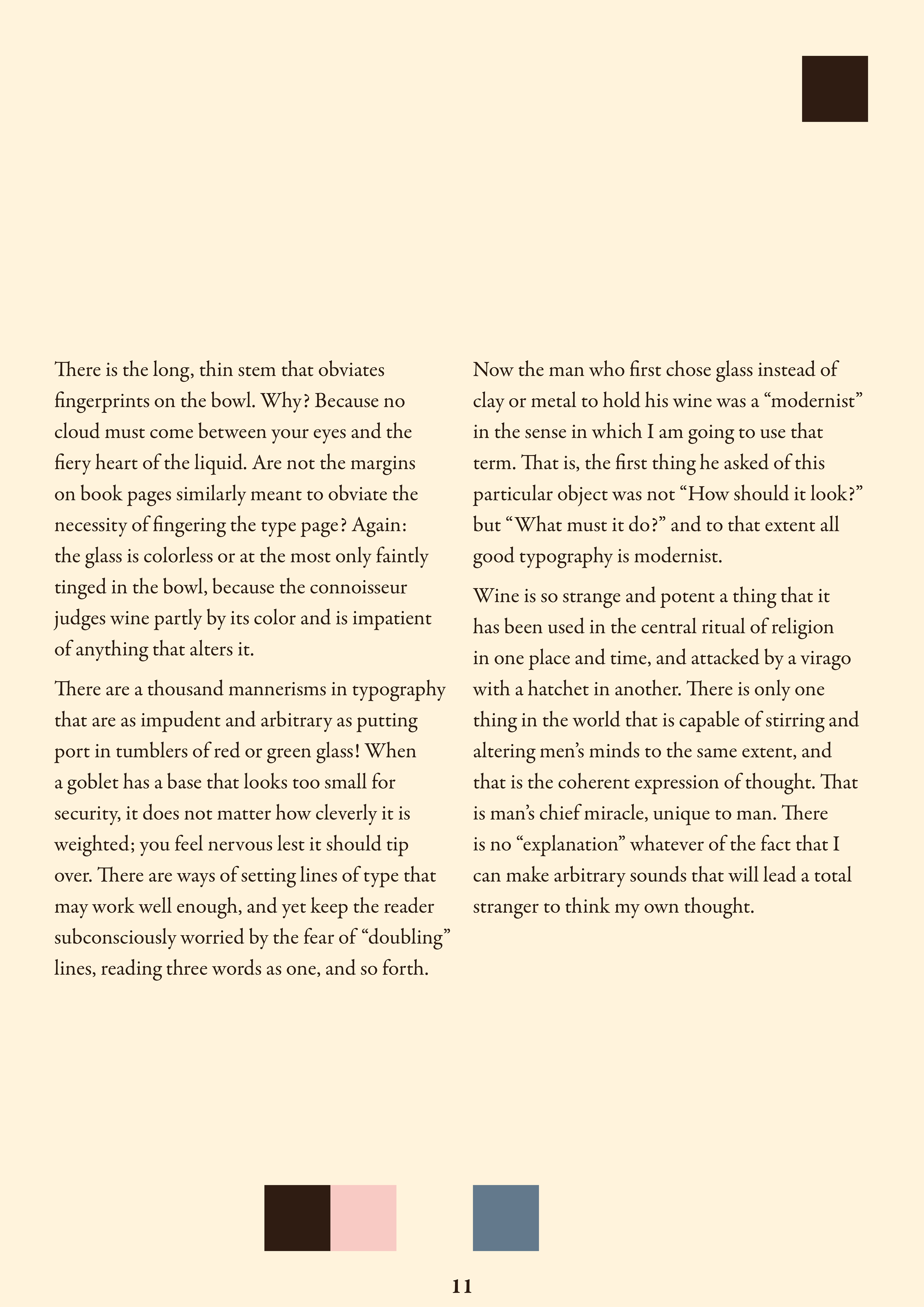
My favourite essay from this collection - 'The Crystal Goblet' by Beatrice Warde.
It was a challenge to keep this book very type orientated as I adore illustration and colour however I have gained a lot of insight from this collection of essays and the course. The constraints made me think of a lot more new ideas and helped me to develop my style as a emerging designer.
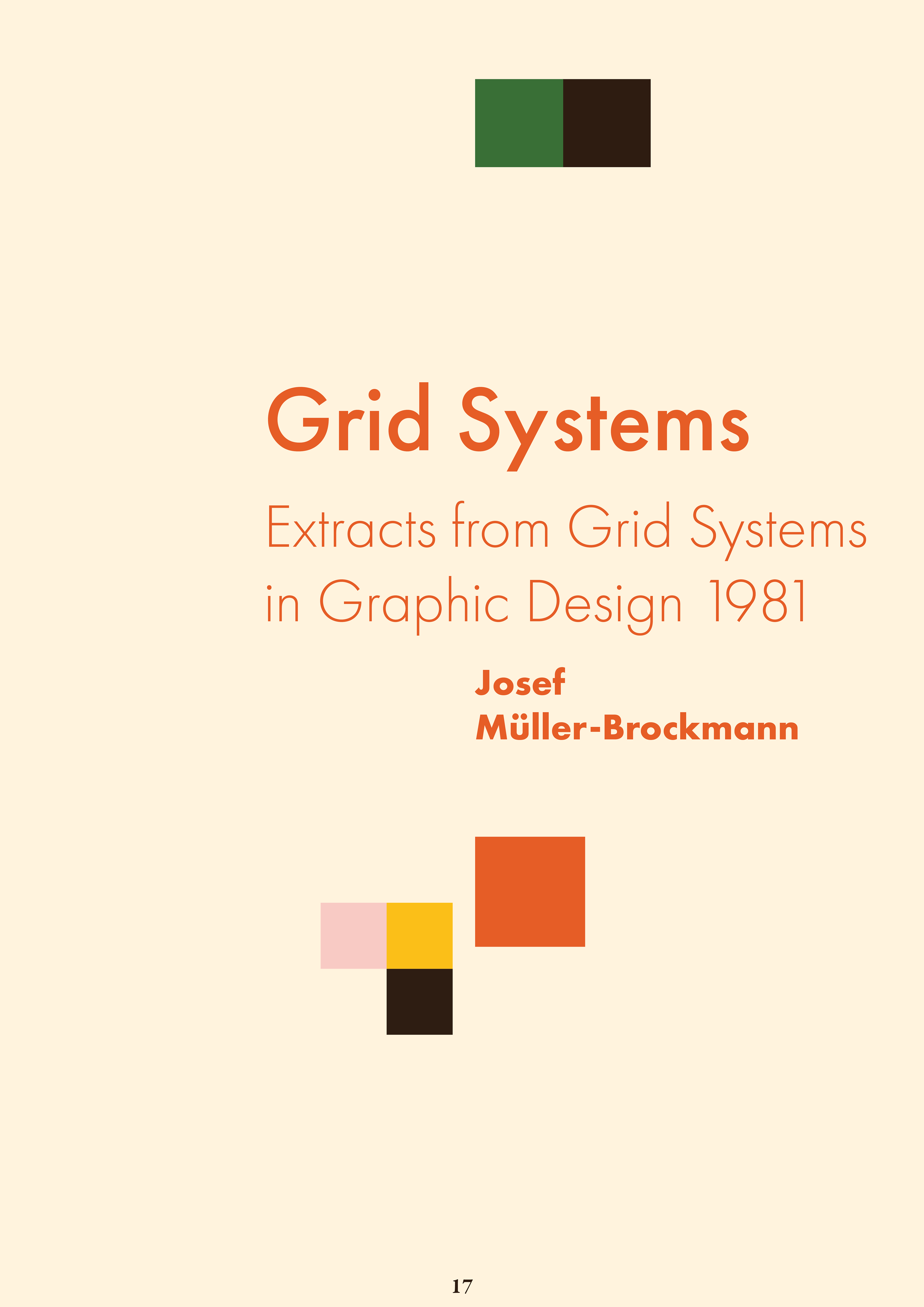
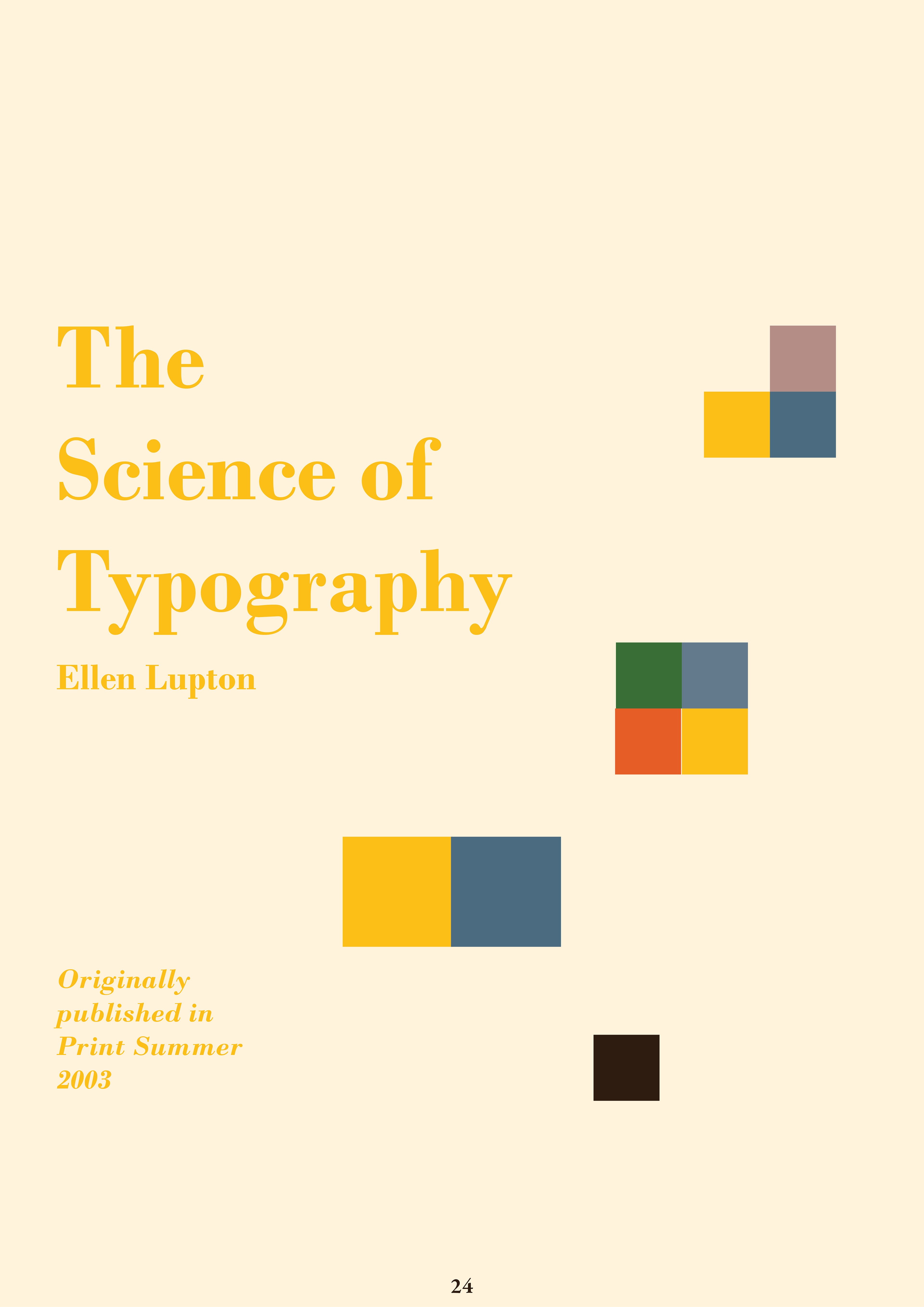
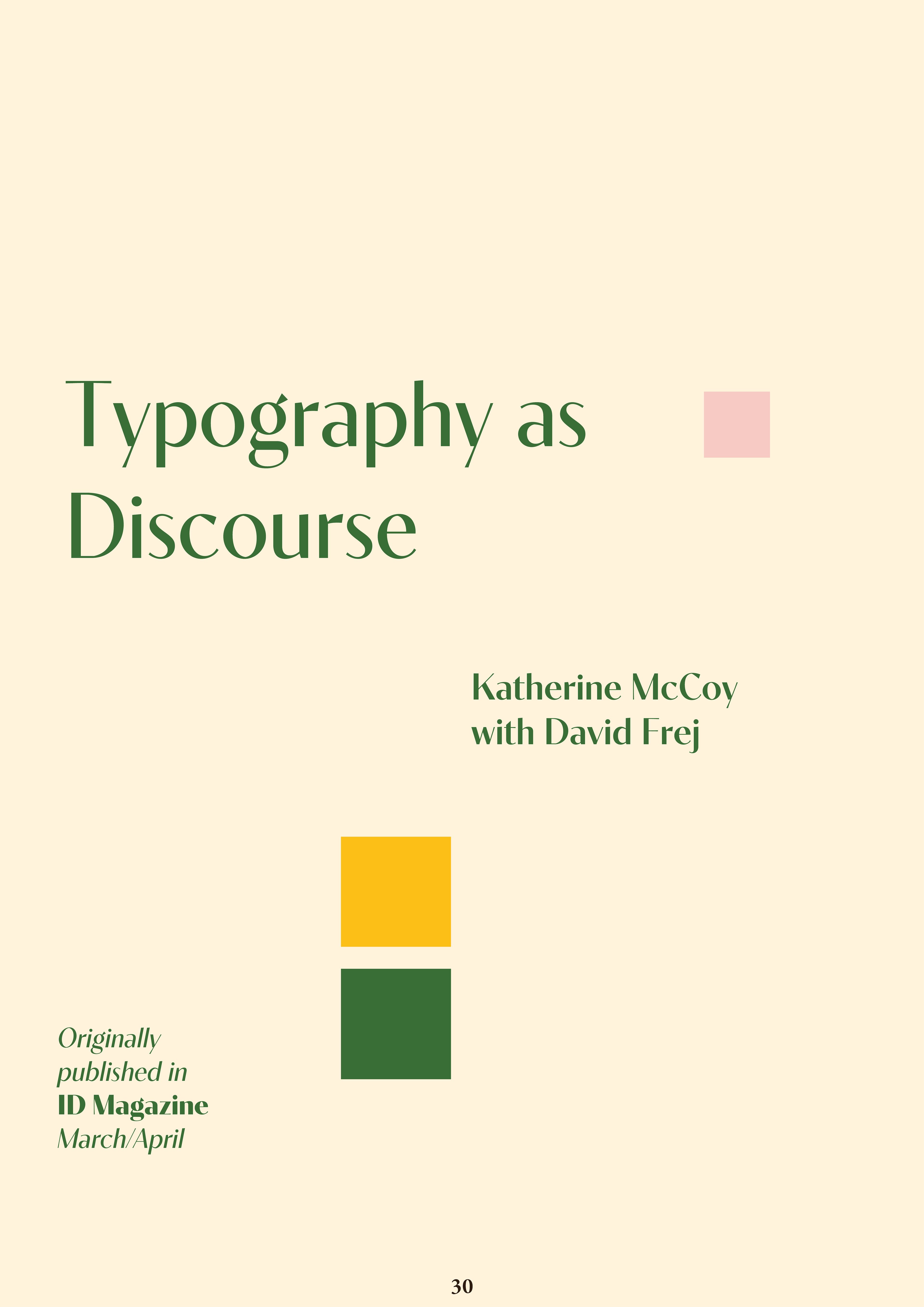
I chose these fonts and colours because I wanted to have a very traditional yet playful feel to this book. The majority of the fonts I chose are very classic and have had long histories of usage in book design, they are all quite old with the exception of the font Contralto.
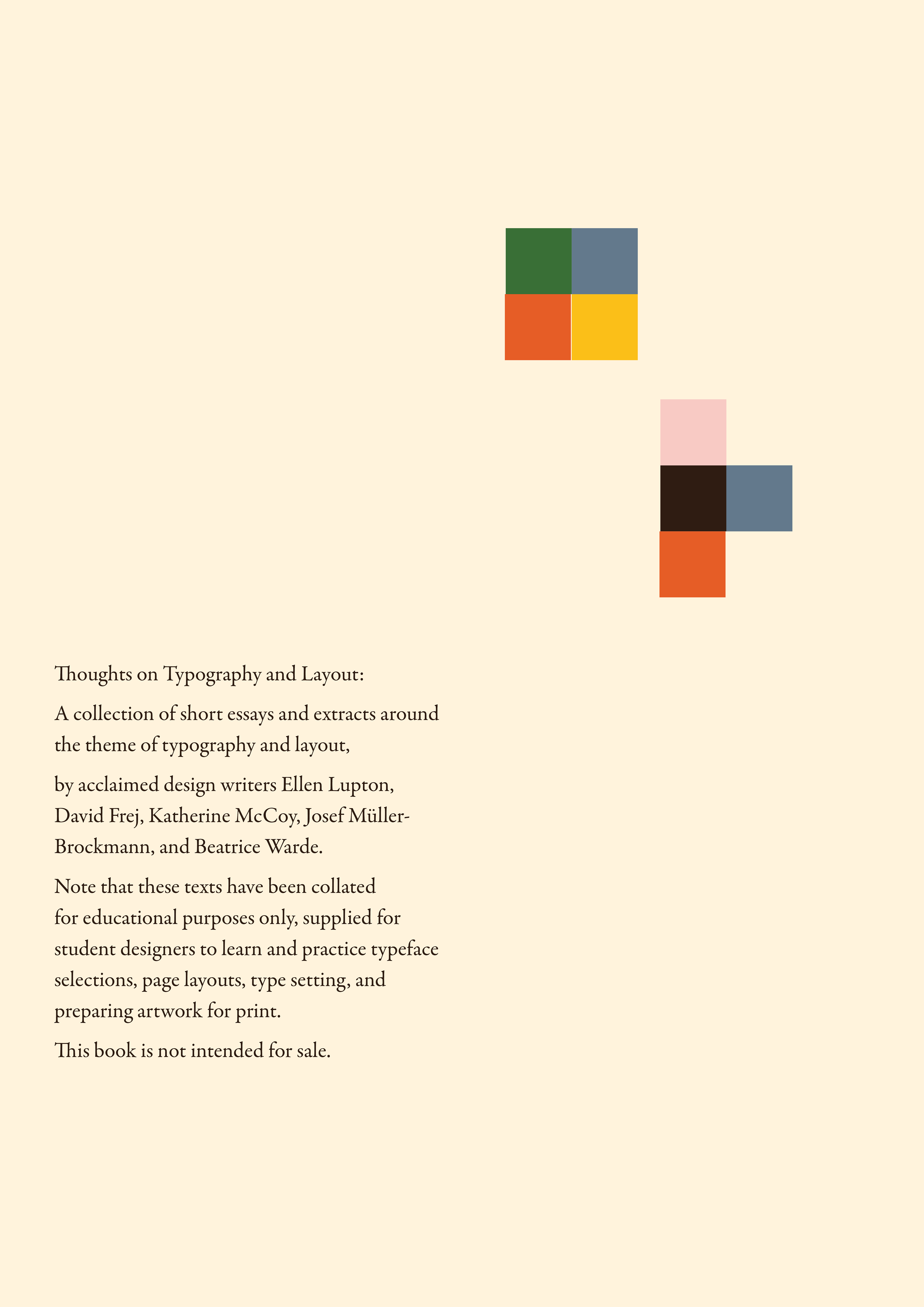
I liked the idea of having almost all primary shades throughout the book and warm tones to make it feel inviting and having these blocks of colour throughout the book was inspired by more vintage visual communication publications from which I sought inspiration. The soft cream background shade seemed to be very easy on the eyes when paired with the dark chocolate body text.
I created my book signatures by printing out eight pages at a time on an A1 poster, folding and gluing each signature, using the same method as if I were printing out zines.
I originally chose to have the text more condensed however I decided that more space and pages would be nicer to a reader. I planned to have much more dynamic headings but decided on a more minimalist route when tackling the project. More whitespace seemed necessary as to not overwhelm.
