
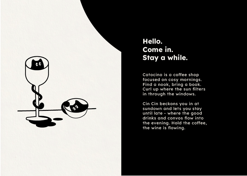
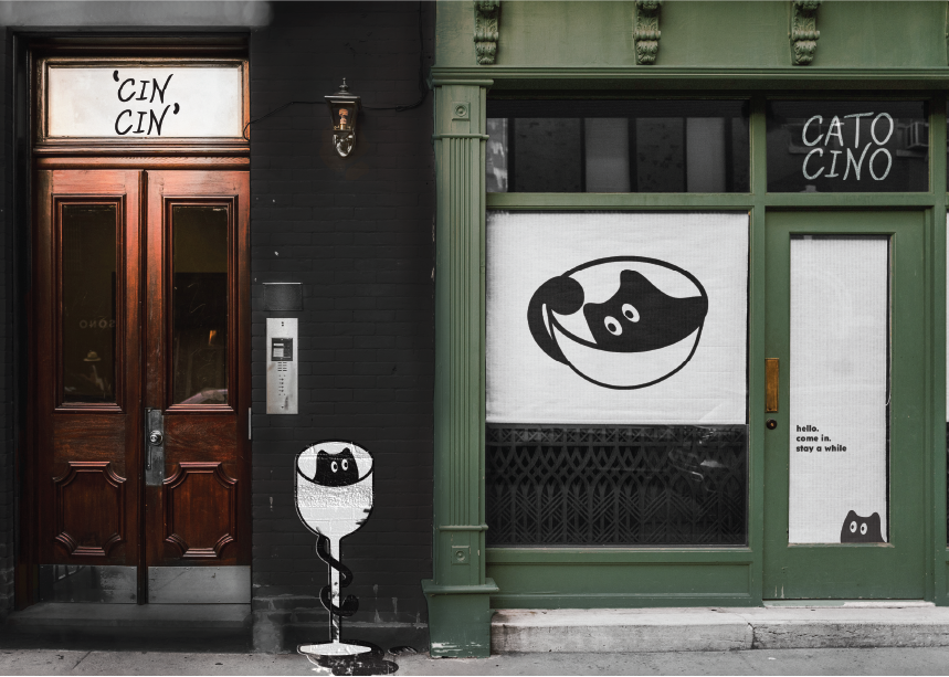
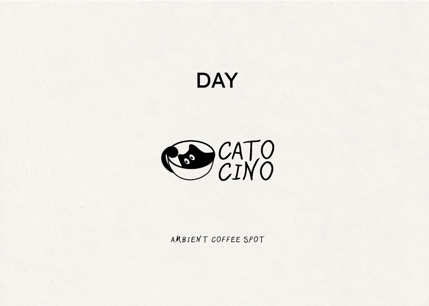
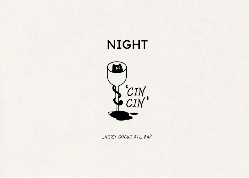
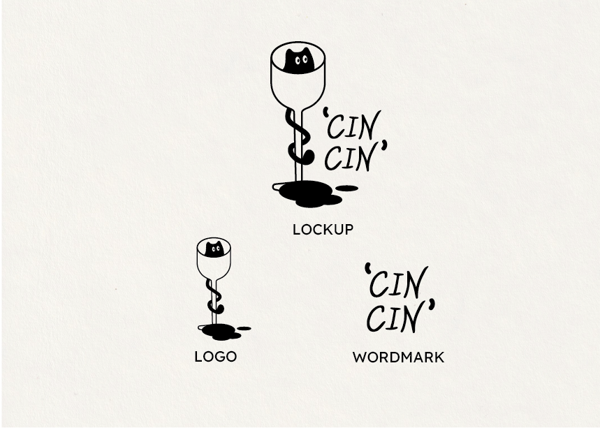
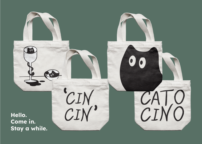
The cat is central to the brand system - it's tail coming to form the handle of the cappuccino cup and weaving around the stem of the Cin Cin wine glass - a splash alludes to the joke that cats are liquid.
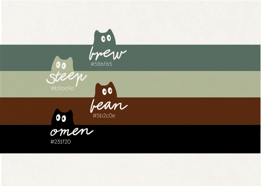
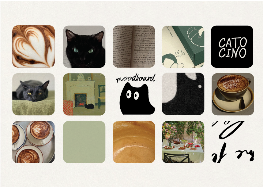
Utilizing a limited palette of four tones which lean earthy and cosy with Omen as an outlier which leans into the black cat superstition. Steep- a low-saturated sage and Bean - a raw sienna tone ground the palette and act as accent tones. The green tea colour Brew is integral to the brand as it is inviting and becomes the architecture.
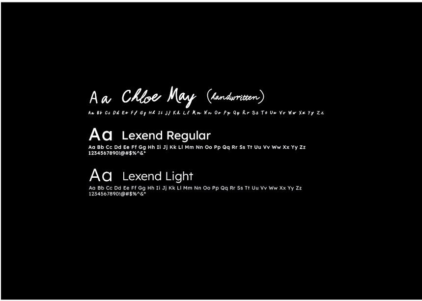
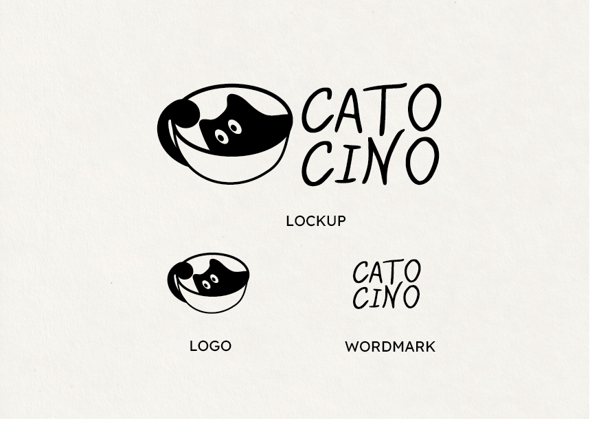
Catocino / Cin Cin was created using a hand lettered typeface based of my own handwriting to evoke a sense of play. The hand lettered wordmarks are complemented by Lexend, a linear sans serif.
Interested in working together?
Visit chloelumsden.com or email chloemayillustration@gmail.com